Go Big or Go Home
The shiny new M+ museum and gallery in the still forthcoming West Kowloon Cultural District is a whole lotta gallery.
Whether it’s an attempt to disprove Hong Kong’s image as cultural wasteland that’s all banks banks banks, or the curators were just so excited to show off all the goodies in storage is impossible to determine after one visit, but the latest addition to Hong Kong’s nascent big ticket gallery scene is, well, a lot. And yes, nascent, because a Maritime Museum hidden away past the busiest ferry piers and Heritage Museum out beyond the reach of most tourists don’t quite cut it. And we’re not talking about the protocols to get in, the snaking line to check booking confirmations and take temperatures etc, etc. We’re talking about the museum itself. M+ is Louvre levels of packed and aspires to be grouped with the likes of the Tate Modern, the MoMA and the Centre Pompidou. It would, however, be nice have Louvre levels of structure to help figure out what you’re looking at, at what you should look at next.
Slapping a few paintings on a wall and making a few notes on a cue card at the lower left does not a museum make. One of the great beauties of the Louvre is the careful curation that goes into each gallery. Ditto for The Uffizi Galleries, and wow, The Rijksmuseum, which knows you want to get to The Night Watch but whose narrative sequence, if you follow the museum’s lead, puts that high profile masterpiece in context and gives it that much more impact when you finally get to it.
It’s worth noting that the Louvre and the Uffizi crafted impeccable storylines in old palaces and offices, spaces hardly ideal for art. The Rijksmuseum was designed to house the Netherlands’ national treasures, so there’s likely a reason the contents flow so well. Swiss starchitect firm Herzog & de Meuron put its stamp on M+, and was the not insignificant design mind behind the high profile Tate Modern and, of course, our own Tai Kwun. So why doesn’t M+ flow like the more apropos Tate?
Don’t take this the wrong way: Having too much to look at is preferable to cavernous, empty spaces and a few pieces scattered around that say very little. M+’s over-ambition is a good problem to have. As it stands, the permanent collection on display numbers over 6,500 pieces, and as of October 2021 there were another 50,000 in the archives. It’s easy to see the museum wanting to show it all off immediately. But there’s something to said for quality versus quantity. An initial visit to M+ is overwhelming, and it can feel like you need to rush through and take it all in rather than savour the single moments. Lest we forget, the Louvre has over 600,000 archive items, and the MoMA 150,000. Patience, Padawan. Patience.
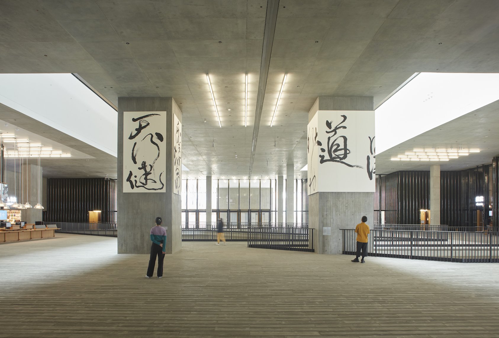
So what’s in there, and what does M+ look like? Right off the bat anyone with a fondness for mid-’50s brutalist architecture is going to love it. A weighty exterior concrete façade carries on all the way through the interiors, with gloriously angular wide open spaces and a light well constructed from floor plate cutaways to cut the uniformity of the grey into geometric blocks. The exterior is also adorned with ceramic tile cladding that looks like bamboo (and which is already chipping, WTF?), that ties in, at least thematically, with the fixed furnishings: café tables, chairs, cashier surfaces, the box office and reception desks are all in bamboo. Essentially it’s a riff on that concrete/stainless steel and wood combination that’s so popular in kitchens and “industrial chic” loft apartments.
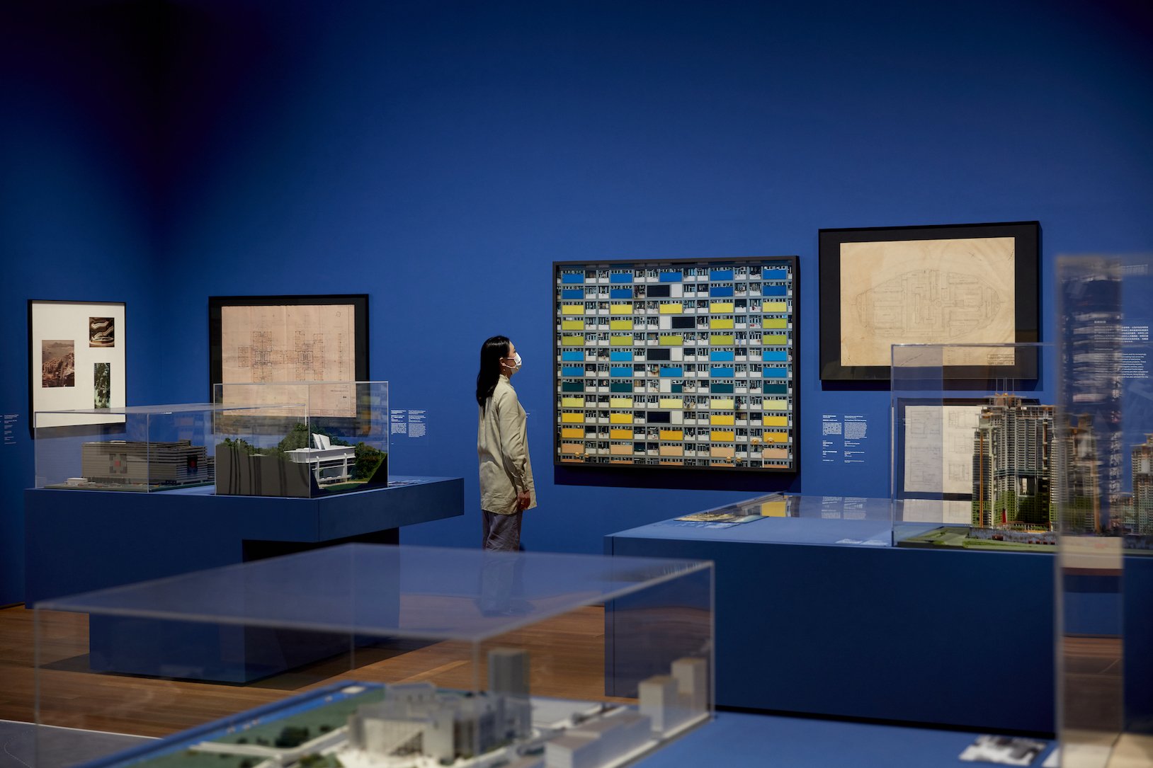
M+ is, technically, a museum of “contemporary visual culture,” (its words), and so the exhibited pieces cover traditional art, product design and architecture and moving media; the Mediatheque is for exploring the museum’s moving image collection, and the cinema is set to open in spring 2022 (we’ll see about that). Of the total 65,000 square metres inside, 17,000 square metres is for exhibitions spanning 33 galleries. The rest of the space is for offices — you can see the tower from the ferry — a research centre, shopping and F&B. This is Hong Kong, you thought they’d skip retailing? CURATOR is what is commonly called the museum coffee shop and this one has a nice waterfront position. Strangely it’s not outrageously priced and the coffee smell is inviting (the coffee could be stronger, but hey, personal taste). The forthcoming restaurants are ADD+, an all-day dining spot looking over the park and serving Asian favourites and Hong Kong standard snacks, and modern Korean at Mosu. The gift shops (which you cannot exit through) are the M+ Shop, focused on stuff to remind you of the exhibitions, and the lifestyle-pitched The Other Shop. Think GOD-lite. Oh, and there’s a roof garden. You can’t sit there.
But what’s in the gallery. There are some gems within its brutal walls, but they need room to breathe. An Ai Weiwei sculpture (Whitewash) is surrounded by paintings, making for a tight fit. With crowds at peak hours during the day — and with kids in tow — it’s downright hazardous to the collection. And the collection is a good one, with a focus on Asia that gives it a unique point of view. The show opener, rightly so, in the Main Gallery on the ground floor Hong Kong: Here and Beyond, a summary of the city’s transformation from fishing village to glass and steel metro through its visual culture from 1960 (until November 2022). COVID means crowd control, so expect lines to get into the galleries, and expect this one to be the longest. Here and Beyond brings new meaning to tenement blocks and neon restaurant signs in equal measure.
On level two are the Sigg Galleries, named for Swiss businessman, art collector and general rich dude Uli Sigg, home to the M+ Sigg Collection: From Revolution to Globalisation, which was donated to the museum in 2012 and spotlights Chinese art from 1970 to 2012 (October 2022); and the East, West, South and Courtyard galleries, which focus on Asian architecture and design (May 2023), British artist Antony Gormley (July 2022), art from the 1950s to present (February 2023) and 1960s conceptual art (September 2022) respectively. The in-between spaces are galleries too. The main lobby shows off one of the museum’s first commissions, calligraphic works by Tong Yang-Tze pulling from I Ching text that couldn’t look better against the raw grey walls and the harrowing (maybe) Found Space in the basement. This stretch of M+ is going to be dedicated to large scale installations — the inaugural display is Sonic Rescue Ropes by Haegue Yang — is the building’s foundation and sits atop the Airport Express and Tung Chung line tunnels; “excavations around the tunnels … that provides an anchor inside the building.” It’s a clever way to incorporate the cityscape with its newest member, rolling them together in a way that manifests Hong Kong’s urban identity in its structures. Time will tell if that was a good idea.
Overall M+ has more going for it than it has stuff to whine about. Among the best of the best: The Kiyotomo Sushi Bar, an exemplar of Kuramata Shiro’s postmodern sensibilities, which was wholly deinstalled from Shinbashi, conserved, shipped, and reinstalled in M+; Lin Tianmiao’s mixed media Braiding; a series of industrial designer Ohashi Teruaki’s home furnishings and a complementing treasure trove of 1980s product design (kids, if you’ve never seen a real Sony Walkman, now’s your chance); Lee Mingwei’s interactive The Letter Writing Project, which is screaming for trouble; photographs by Chang Chao-Tang and Ma Liuming; and To Add One Metre to an Anonymous Mountain, a video installation and photo that’s the subject of a short talk by M+ staff on-site for anyone who ambles by at the right time. The explainer is a great idea and fingers crossed the museum makes it a regular feature with other pieces.
M+
Where: 38 Museum Drive, West Kowloon Cultural District
Hours: Tuesday to Thursday, Saturday, Sunday, Public Holidays: 10am to 6pm; Friday 10am to 10pm. Check with M+ for COVID hours
Closed: Mondays, January 1, first and second day of Lunar New Year, December 25
Details: www.mplus.org.hk


