Brand HK
Graphic artist Henry Steiner is responsible for a great deal of the imagery of our everyday lives – for better and worse.
Hongkong Land. Dairy Farm. TaiKoo Sugar. Hongkong Land. Wellcome. The Hong Kong Jockey Club logo (updated for its post-Royal years). Bank notes for Standard Chartered. Probably most famously its competitor’s ubiquitous logo – the red and white hexagon of HSBC.
The only thing these organisations really have in common is the fact that much of their contemporary branding was created by 60-year Hong Kong resident Henry Steiner. That one designer came up with a slew of instantly recognisable logos and languages in just a half-century isn’t surprising. What’s surprising is that Steiner’s work is so heavily concentrated in Hong Kong that it puts him on the super-short list of people to have had a hand in creating the city’s visual identity. It’s also the reason he’s getting a retrospective of his work at M+ in Henry Steiner: The Art of Graphic Communication.
Opening on June 15 (the exhibit officially closes November 10, but that could change), 200 individual objects, the majority from M+’s own collection, combined with 80 from Steiner’s private stash, are on display to give Steiner and his work historical context and some much needed kudos. Broken into two sections, part one covers Steiner’s formative early years in Europe and the USA, and his arrival in Hong Kong in 1961. Part two focuses on his work after he landed in Hong Kong – and how those now indelible designs reflect the city’s development in the second half of the 20th century. Steiner put his singular cross-cultural stamp on everything from consumer products and hotels to private clubs and Fortune 500 companies. It’s hard to walk down the street and not see Steiner’s mark, even if you don’t know it.
An Austrian Jew who fled the country with his family after the German Reich took over in 1938 (with an assist from silent era Hollywood film producer Julius Steger) Steiner studied at Hunter College, at Yale, and at the Sorbonne before getting transferred to Hong Kong in ’61. The idea was to work on the (then) cutting-edge The Asia Magazine for a year or so and go home. A familiar story for many expatriate Hongkongers, he never left. He also founded Graphic Communications Limited in 1964 (rebranding as Steiner&Co in the 1990s) and never looked back.
Steiner is a contemporary of some of the world’s most notable graphic designers, many of them frequently (and unjustly) more recognisable than he: Parco mastermind Eiko Ishioka; Saul Bass, best known for Alfred Hitchcock poster art like Vertigo; Steiner’s instructor at Yale, Paul Rand, famed for creating logos for IBM and UPS; Max Miedinger, the creator of Helvetica (Gary Hustwit made a documentary about this font); and the designer who gave us I [Heart] New York, Milton Glaser. Steiner has very much woven himself into the fabric of life here, and the exhibition does a nice job of linking his graphics work with the evolution of Hong Kong; many of the spotlight items are linked to a slice of history – like the TaiKoo Sugar docklands and the Textile Alliance. But Steiner honed his art long before visuals would become so monumental to everyday life. Unsavoury as it may be to point out, HSBC’s instantly identifiable brand logo now conjures equally identifiable negative associations. The world’s local bank is also the one that laundered money for a Mexican drug cartel and helped the ultra-wealthy dodge taxes. He’s not alone; Rand designed Enron’s logo. What Steiner thinks of his work being associated with that kind of ignominy is anyone’s guess, but as M+ curator Tina Pang relayed, “For Steiner, the work he did for clients was about durability and longevity. Many of the [designs] he worked on are still in use. I don’t think he thinks of his clients’ visuals on a continual basis; it’s a job and it’s over. And he can’t control what the client brings to that work over time.”
“Visual culture is about how we see the world and how we see its transformation through time,” adds associate curator Dr Vennes Cheng. “That’s the beauty of visual culture.”
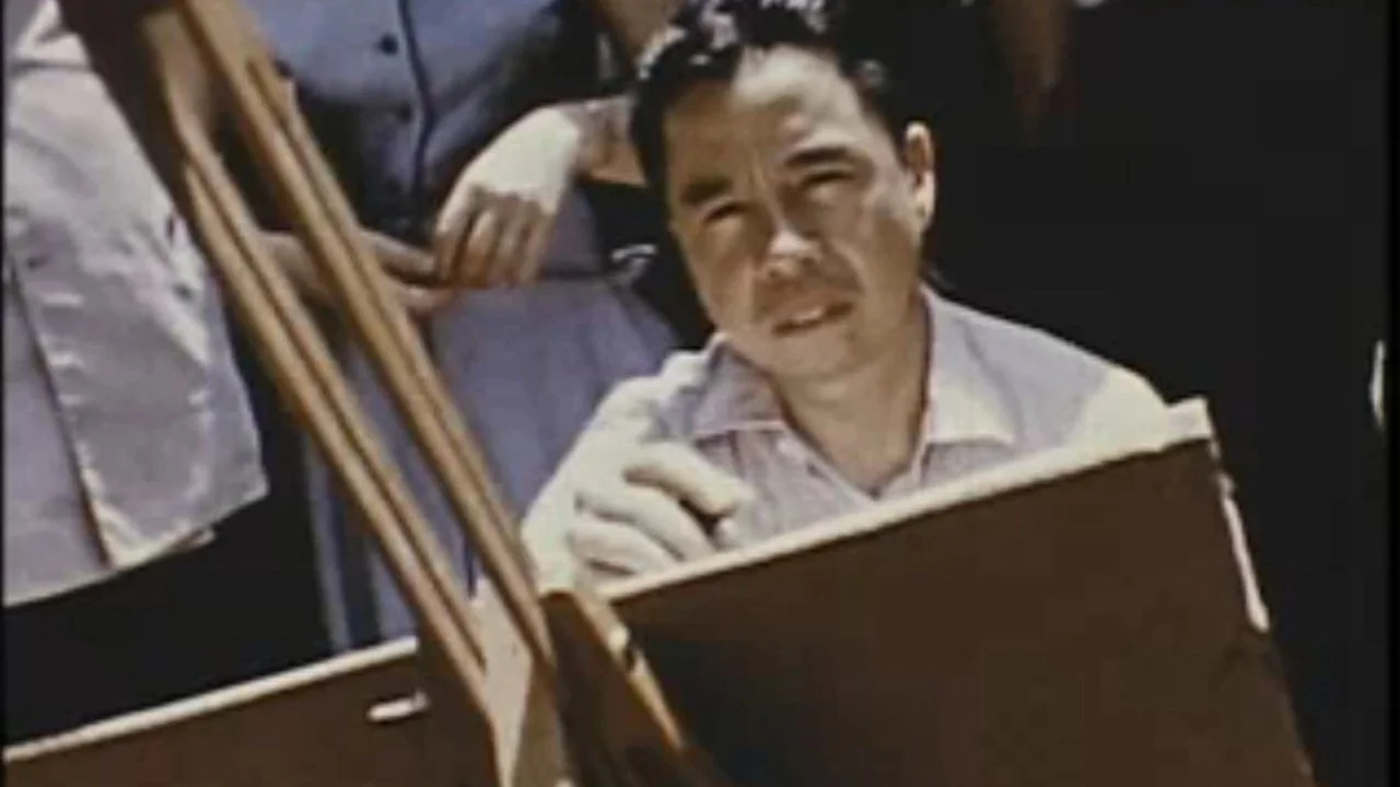
As an added bonus, the Cinema at M+ will be screening a pair of docs that are Steiner adjacent on July 5. In The World of Dong Kingman (1954), legendary cinematographer James Wong Howe (shooter of stone classics Seconds by John Frankenheimer, Martin Ritt’s Hud and the way-ahead-of-the-curve Sweet Smell of Success among dozens of others) chronicles the Chinese-American artist working in Chinatown in the ’50s. Dong was one of Steiner’s instructors at Hunter. And Lee Evan Caplin’s Andy Warhol: Made in China is a snapshot of the New York egoist’s short trip to Beijing in 1983, and captures his bafflement at 1) not being recognised as a Famous Person and 2) that Beijing was so quiet by 6pm. The Steiner connection comes via Warhol’s invitation from Hong Kong entrepreneur Alfred Siu to his brand new private members’ I Club, in the Bank of America Tower. It may have been envisioned as Hong Kong’s answer to Studio 54 and defunct as quickly as it was born, but the timeless branding on the club materials encapsulates what made Steiner Steiner.
Steiner and local designer-writer Billy Potts kick off the exhibition with “In Conversation with Henry Steiner” (in English with Cantonese interpretation) at The Forum on the 15th, starting at 2:30pm. If you want even more background, this is your chance. Henry Steiner: The Art of Graphic Communication is free with admission to M+.


